Mastering Playwright for Mobile Testing

Let's be honest: in a world where mobile traffic dominates, making sure your web app works perfectly on phones and tablets isn't just a "nice-to-have." It's non-negotiable. And that’s exactly where Playwright for mobile testing shines, offering a unified and powerful way to handle the entire process. It goes way beyond just resizing a browser window.
So, is Playwright a solid choice for mobile web testing? Absolutely. It lets you emulate mobile browsers like Chrome for Android and Mobile Safari right out of the box. This makes testing responsive designs and user interactions on different devices fast and efficient, all without needing a rack of physical hardware.
Why Use Playwright for Mobile Web Testing?
The real power of Playwright lies in its high-fidelity device emulation. Instead of simply shrinking a viewport, Playwright meticulously simulates the key characteristics that make a mobile device unique.
- Accurate Viewports: It sets the precise screen resolution for hundreds of pre-configured devices, from an 'iPhone 14 Pro' to a 'Pixel 7'.
- Correct User Agent: Your server sees requests exactly as if they came from a real mobile browser, ensuring your app renders correctly.
- Touch Event Simulation: Playwright can genuinely perform taps, swipes, and pinches, mimicking how a real person interacts with a touchscreen.
- Device Scale Factor: It correctly handles pixel density, which is critical for ensuring your UI looks sharp on high-resolution displays.
This isn't just theory. The data shows a dramatic reduction in test flakiness for teams that switch to Playwright.
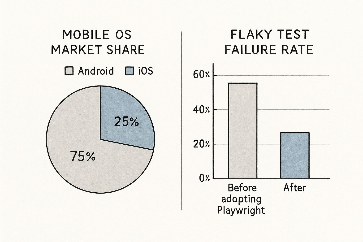
While Android clearly has the bigger market share, the key takeaway here is that a solid testing strategy drastically cuts down on unreliable test results. For any engineering team, making automation more stable and predictable is a massive win.
Playwright Emulation vs Traditional Simulators
You might be wondering how this compares to older methods. Playwright's built-in emulation offers some distinct advantages over traditional, separate simulator tools. It's faster, lighter, and more integrated into your development workflow.
Here’s a quick breakdown:
| Feature | Playwright Emulation | Traditional Simulators/Emulators |
|---|---|---|
| Setup & Overhead | Lightweight, integrated into the test runner. No extra software needed. | Heavyweight, require separate installation and configuration. |
| Execution Speed | Extremely fast, runs headlessly within the browser engine. | Slower, as they boot an entire mobile OS. |
| Resource Usage | Low memory and CPU footprint, ideal for CI environments. | High resource consumption, can be a bottleneck in CI. |
| Test Scope | Focused on web content and browser behavior. | Can test native app features and system-level interactions. |
| Ease of Use | Simple to configure with a single line of code. | Complex setup and often requires specific SDKs. |
For testing mobile web applications, Playwright’s approach is often the more pragmatic and efficient choice. It gives you all the context you need to validate the web experience without the overhead of a full OS simulation.
Efficiency And Cost Savings
Let’s talk about the bottom line. Managing a physical device farm is both expensive and a huge time sink. Playwright's approach completely sidesteps this problem for most web testing. You can spin up hundreds of tests in parallel across dozens of mobile profiles, all from your CI/CD pipeline. The result is a dramatic drop in infrastructure costs and test execution times.
This efficiency is fueling incredible growth. The mobile application testing services market was valued at USD 10.18 billion and is projected to hit an eye-watering USD 42.4 billion by 2033. This surge shows just how much demand there is for better, smarter testing tools. If you're curious to learn more, we have a whole article exploring if Playwright can be used for mobile testing.
One of my favorite features is the ability to emulate network conditions. By setting the network to 'slow-3g' or even 'offline' mode, Playwright lets you validate your app's performance under the real-world constraints your users face every day. That's something that’s incredibly difficult to replicate consistently with physical devices, and it helps you find and fix frustrating bugs long before they ever reach production.
Getting Your First Mobile Testing Project Configured
Before you write a single line of test code, getting the project foundation right is everything. A solid configuration from the start is what separates a smooth, scalable testing process from a frustrating one. It all begins with initializing a new project.
Just open your terminal in an empty directory and kick things off with one command:
npm init playwright@latest
This little command is incredibly powerful. It scaffolds a complete Playwright project for you, creating the essential playwright.config.ts file, some example tests to get you started, and even installs the browser binaries you'll need. During the interactive setup, I'd strongly recommend choosing TypeScript for better type safety and saying yes to the GitHub Actions workflow if you plan on integrating with CI/CD down the road.
Defining Mobile Projects in the Config File
Now for the fun part. The heart of your entire setup lives inside the playwright.config.ts file. This is where you tell Playwright how to run your tests, and most importantly for us, which mobile devices to pretend to be. Thankfully, Playwright makes this incredibly simple with its built-in device descriptors.
You can define specific configurations for different devices right inside the projects array. For instance, if you want to test against a modern iPhone and a popular Android phone, your config might look something like this:
// playwright.config.ts
import { defineConfig, devices } from '@playwright/test';
export default defineConfig({
// ... other settings
projects: [
{
name: 'chromium',
use: { ...devices['Desktop Chrome'] },
},
/* Mobile Configurations */
{
  name: 'Mobile Chrome',
  use: { ...devices['Pixel 7'] },
},
{
  name: 'Mobile Safari',
  use: { ...devices['iPhone 14 Pro'] },
},
],
});
With this in place, you’ve just created three distinct test environments. When it's time to run your test suite, you can target each one by name. This lets you execute the exact same tests against a standard desktop browser, an emulated Android device, and an emulated iOS device. It's a game-changer for coverage.
Pro Tip: Want to see the full list of devices Playwright knows about? Just run npx playwright-cli show-devices in your terminal. It's a fantastic way to find the exact device you need, from various iPhones and Pixels to Samsung Galaxy phones and iPads.What Do Those Device Properties Actually Do?
So, what’s the magic behind { ...devices['Pixel 7'] }? That spread operator is pulling in a predefined object packed with all the properties needed to accurately simulate that specific device. It’s not just resizing the window; it’s a whole lot more.
Here's a breakdown of what it's configuring for you:
viewport: Sets the precise screen resolution, like{ width: 393, height: 851 }for an iPhone 14 Pro.userAgent: Provides the exact user-agent string that a real device's browser would send. This is crucial for things like server-side rendering and analytics.deviceScaleFactor: Accounts for high-resolution "Retina" displays, ensuring your screenshots and visual comparisons are pixel-perfect.isMobile: A simple boolean that tells the browser engine to enable mobile-specific behaviors.hasTouch: Another boolean that signals the availability of a touchscreen, allowing you to properly simulate taps and swipes.
By taking a few minutes to configure these projects upfront, you've laid the groundwork for a truly robust mobile testing strategy. Now, every test you write can be effortlessly run against these profiles, giving you confidence that your app works flawlessly for everyone, no matter their device. This initial setup pays for itself a hundred times over.
Writing Your First Mobile Web Test
Now that your project is configured, you can shift from setup to scripting. The good news is that writing a mobile web test in Playwright feels a lot like writing a standard desktop test. The main difference lies in a few key considerations for mobile-specific layouts and interactions.
Let's walk through a real-world scenario: testing the mobile checkout flow on a responsive e-commerce site. Our goal is to simulate a user adding an item to their cart and heading to checkout. On a mobile device, this almost always means dealing with a collapsed navigation or "hamburger" menu, which is the perfect place for our test to start.
Interacting With Mobile-Specific Elements
The first hurdle in mobile testing is often handling elements that only show up on smaller viewports. The classic example is the hamburger menu icon that hides the main navigation. A solid test has to account for this user flow.
This is where Playwright's auto-waiting capabilities are a massive help. You can forget about adding manual waits or waitForTimeout calls. When you tell Playwright to click an element, it automatically waits until that element is visible, stable, and ready to be clicked. This is a fundamental part of avoiding flaky tests.
Let's see what this looks like in practice:
import { test, expect } from '@playwright/test';
// We'll use the 'Mobile Chrome' project we defined in our config
test.describe('E-commerce Mobile Checkout Flow', () => {
test('should allow a user to add an item to the cart', async ({ page }) => {
await page.goto('https://your-ecommerce-site.com');
// Tap the hamburger menu to reveal navigation
await page.locator('[data-testid="hamburger-menu"]').tap();

// Click the 'Shop' link once it's visible
await page.locator('a:has-text("Shop")').click();

// The rest of the test flow...
});
});
You might have noticed we used page.locator(...).tap() instead of click(). While click() often works just fine, tap() is a better choice for playwright for mobile testing because it more accurately simulates a real touch event on a screen.
Writing Resilient Selectors
A common pitfall I see is writing selectors that are too tied to the desktop layout. A selector like #main-nav > ul > li:nth-child(3) > a is incredibly brittle. It will almost certainly break on a mobile view where the navigation is completely restructured.
The best practice is to lean on test-specific attributes like data-testid. These attributes don't care about CSS styling or the element's structure, which makes your tests far more resilient to UI changes. If you can't add test IDs, use locators based on visible text or ARIA roles.Here’s how we can continue our test, using resilient selectors to find and add a product to the cart:
// ...inside the test block
// Select a product by its visible name
const product = page.locator('.product-card', { hasText: 'Classic Tee' });
await product.locator('button:has-text("Add to Cart")').click();
// Verify the cart icon now shows "1"
await expect(page.locator('[data-testid="cart-count"]')).toHaveText('1');
// Proceed to checkout
await page.locator('[data-testid="checkout-button"]').click();
// Assert we are on the checkout page
await expect(page).toHaveURL(/.*checkout/);
See how we chained locators to narrow our search (page.locator(...), { hasText: ... }) and relied on text content to find the right buttons? This approach makes the test much easier to read and less likely to fail after minor markup tweaks.
The importance of reliable automation is clearly reflected in the market's explosive growth. The mobile application testing solutions market was valued at around USD 6.9 billion and is projected to hit USD 8.1 billion soon. Looking further out, forecasts estimate a surge to USD 61.8 billion by 2037, all driven by the relentless demand for high-quality mobile experiences. You can dig deeper into the mobile testing solution market trends driving this growth.
By combining thoughtful locators with Playwright's mobile emulation and auto-waiting features, you can write clean, maintainable, and highly effective tests that truly validate the mobile user journey.
Advanced Mobile Emulation And Mocking

Basic device emulation is a great starting point, but to really build a bulletproof mobile web app, you have to test beyond the "happy path." What happens when things get messy and unpredictable? That's where your users live, and it's where Playwright’s advanced emulation and mocking tools become your best friend for playwright for mobile testing.
These features let you script and reliably replicate edge cases that are a nightmare to test manually. Think about a user on a spotty train connection or someone opening your app in a completely different time zone. With Playwright, you can bake these scenarios right into your test suite.
Simulating Unreliable Network Conditions
One of the most valuable features you can use is network throttling. That lightning-fast office Wi-Fi? It's not how most people experience the web. Playwright makes it incredibly simple to simulate different network speeds, either in your global config or on a per-test basis.
slow-3g: This is perfect for mimicking a weak 3G connection. Use it to see how your loading states and skeleton screens hold up under pressure.offline: This one completely cuts the network. It's essential for testing your Progressive Web App (PWA) offline features or seeing how gracefully your app handles a sudden connection drop.
Here’s a quick look at how you might apply it directly in a test:
test('should display loading indicator on a slow connection', async ({ page }) => {
// Throttle network to simulate a slow 3G connection
await page.emulate({ network: 'slow-3g' });
await page.goto('https://your-data-heavy-page.com');
// Now, assert that your app's loading spinner is visible
await expect(page.locator('[data-testid="loading-spinner"]')).toBeVisible();
});
Just adding that one line makes your tests infinitely more realistic. It helps you catch frustrating performance bottlenecks before your users ever see them.
Mocking Geolocation and Permissions
Does your app use location-based features, like a store finder or local weather? Trying to manually test this from different cities is basically impossible. Playwright lets you mock geolocation data with just a few lines of code.
You can set precise latitude and longitude coordinates, convincing your test it's running from anywhere in the world. The same idea applies to browser permissions for things like notifications, camera access, or the microphone. You can pre-grant or deny them to test every user flow without getting stuck on disruptive pop-ups.
By mastering these advanced emulation techniques, you move from simply checking layouts to validating resilience. You're not just asking, "Does it look right on an iPhone?" but rather, "Does it still work for a user in Tokyo, on a slow network, with location services denied?"
This global perspective is what separates good apps from great ones. For instance, while Europe accounts for over 29% of the mobile testing market, the Asia Pacific region is seeing explosive growth. Understanding these diverse user environments is key, and you can discover more insights about these market dynamics. For more technical strategies, our guide on mastering Playwright mobile app testing is a great next step.
Beyond location, you can also simulate different color schemes to validate your dark and light modes or set a specific timezone to check that dates and times are handled correctly. Combining these tools gives you a powerful arsenal to hunt down those tricky, environment-specific bugs that always seem to slip through to production.
Integrating Mobile Tests into a CI/CD Pipeline

Testing on your local machine is a great start, but the real magic happens when your tests run automatically with every single code change. This is where integrating your Playwright mobile tests into a Continuous Integration/Continuous Deployment (CI/CD) pipeline comes in.
By doing this, you create a powerful safety net. Every pull request gets automatically validated against your key mobile viewports before it has any chance of reaching production. It’s the best way I know to catch responsive design bugs early and give your team the confidence to deploy faster.
With a platform like GitHub Actions, setting this up is surprisingly straightforward. A simple workflow file is all you need to tell the CI runner to check out your code, install dependencies, and run your entire test suite headlessly.
Setting Up a GitHub Actions Workflow
The heart of any CI setup is the workflow file, which you'll typically place in .github/workflows/playwright.yml. This YAML file defines the triggers, jobs, and individual steps for your automation. For a Playwright project, the process boils down to installing Node.js, your project's npm packages, and Playwright's browser-specific dependencies.
Fortunately, Playwright makes this incredibly simple. A single command, npx playwright install-deps, handles all the heavy lifting by installing the necessary system libraries for the browser binaries. Once that's done, you just need to run your tests.
Here is a complete, copy-and-paste-ready example for a GitHub Actions workflow:
name: Playwright Mobile Tests
on:
push:
branches: [ main, develop ]
pull_request:
branches: [ main, develop ]
jobs:
test:
timeout-minutes: 60
runs-on: ubuntu-latest
steps:
- uses: actions/checkout@v4
- uses: actions/setup-node@v4
with:
node-version: 18
- name: Install dependencies
run: npm ci
- name: Install Playwright Browsers & Dependencies
run: npx playwright install --with-deps
- name: Run Playwright tests
run: npx playwright test --project="Mobile Chrome" --project="Mobile Safari"
- uses: actions/upload-artifact@v4
if: always()
with:
name: playwright-report
path: playwright-report/
retention-days: 30
This workflow is configured to run your tests against the "Mobile Chrome" and "Mobile Safari" projects you defined in your Playwright config. The final step is crucial: it uploads the test report as an artifact. This lets you easily review detailed results, screenshots, and traces directly from the GitHub UI, which is a lifesaver for debugging failed runs.
As your pipeline matures, it's a good idea to think about broader strategies for top-tier testing and software QA management to build a truly holistic approach to quality.
Running tests in parallel is a massive performance win. By settingfullyParallel: truein yourplaywright.config.ts, you can instruct the CI runner to execute test files simultaneously, drastically reducing the total runtime. This fast feedback loop is what makes CI so valuable.
For a deeper dive into the nuances of this process, you can find more information about Playwright for mobile app testing and how it fits into larger automation strategies.
Common Questions About Playwright for Mobile Testing
As more teams start using Playwright for mobile testing, a few questions almost always pop up. Getting a clear picture of what the framework can and can’t do is the first step to building a solid testing strategy. Let's dig into some of the most common ones.
Can Playwright Test Native iOS or Android Apps?
The short answer is no. Playwright is a powerhouse, but its domain is web applications. Its real strength lies in running tests against mobile browsers like Chrome for Android and Mobile Safari, using its incredibly robust device emulation features.
However, Playwright isn't built to automate native applications—the kind you download from the App Store or Google Play. If you need to test native mobile apps, you’ll want to look at frameworks designed specifically for that world, such as:
- Appium: A very popular open-source tool for automating native and hybrid apps.
- Espresso: Google's own native testing framework for Android.
- XCUITest: Apple's native testing framework for iOS.
Think of Playwright as your go-to for anything that runs inside a mobile browser, from simple responsive websites to complex Progressive Web Apps (PWAs).
How Is Playwright Emulation Different From a Real Device?
This is a critical distinction to understand. Playwright's device emulation is exceptionally accurate for everything happening within the web view. It flawlessly simulates the device's viewport, pixel density (deviceScaleFactor), user agent string, and touch events. For validating responsive layouts, UI components, and web-based user flows, it's pretty much perfect.
What emulation doesn't do is replicate the device's underlying hardware (like a specific CPU or GPU) or the full native operating system. For deep performance profiling or tests that need to interact with OS-level features—like opening the native camera app—a real device is still the gold standard for that final validation.
That said, for the vast majority of web testing scenarios, Playwright’s high-fidelity emulation gives you more than enough accuracy to catch bugs early and efficiently.
What Is the Best Way to Handle Responsive Elements?
Ah, the classic challenge: handling elements that change between desktop and mobile. From experience, the most resilient approach is to use locators that aren't tied to the page's structure, like data-testid attributes. They stick around no matter how the CSS or layout shifts.
If an element is fundamentally different—say, a hamburger menu on mobile versus a full navigation bar on desktop—you have a couple of clean options. You could use Playwright's locator.or() method to find whichever element is currently visible.
An even better practice, in my opinion, is to separate your mobile-specific user flows into their own dedicated test files or describe blocks. This keeps your tests organized, easier to read, and much simpler to maintain in the long run.
At Mergify, we believe in empowering developers with tools that make their workflows more efficient and their code more reliable. By integrating robust testing strategies into a streamlined CI/CD pipeline, you can catch bugs earlier and deploy with confidence. Learn how Mergify's Merge Queue and CI Insights can help your team save time and reduce frustration.